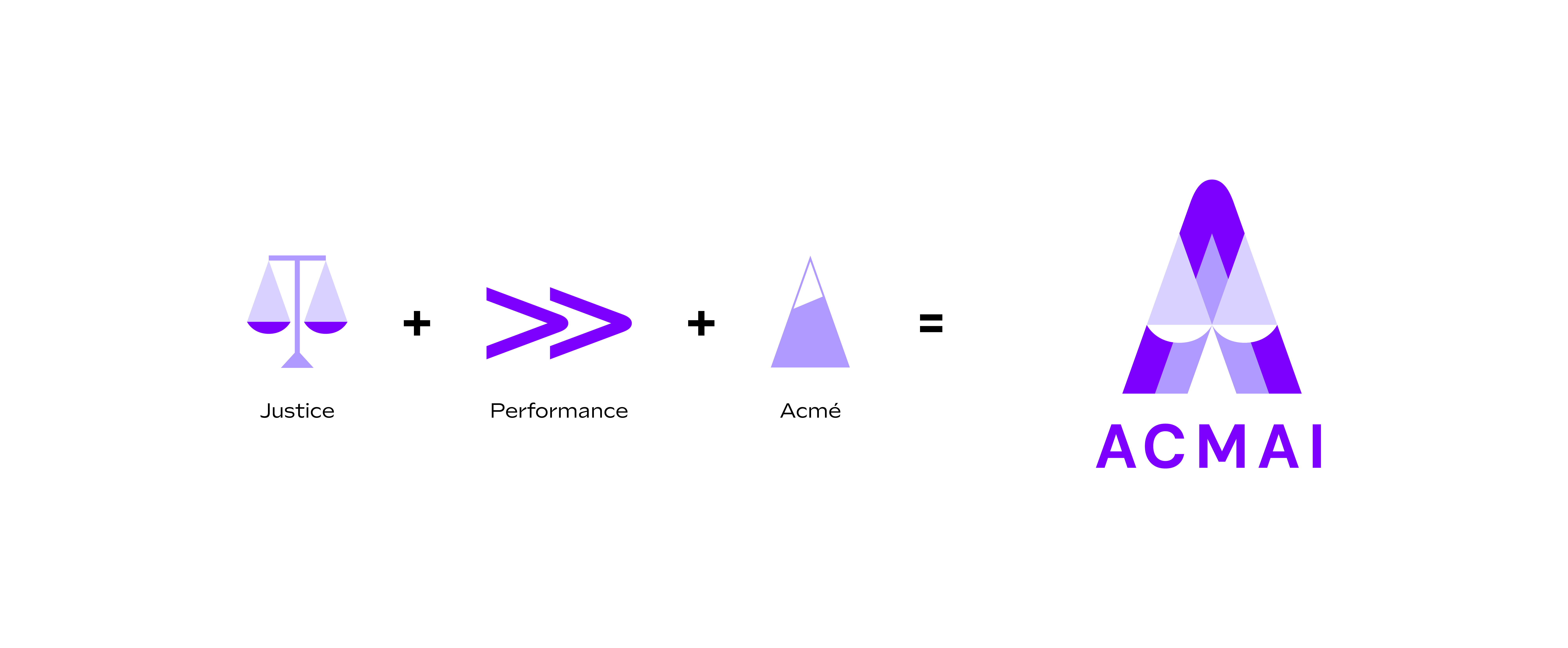
As ACMAI is a law firm dedicated to new technologies, its expertise is new and needs to be clearly understood. So, to differentiate itself from other Tech brands, the symbol of justice has been deliberately represented.
Its customers are dynamic companies operating in all sectors. Whether they are start-ups or large companies, their ambition is in line with ACMAI's desire to transform their legal constraints into a lever for growth. This notion of performance is reflected in the rising shape of the emblem and the double arrow.
The peak echoes the firm's name – which is the homonym of 'acme' – and gives a precise and lively aspect to the whole, which can also be compared with the assertiveness of the strategies proposed.
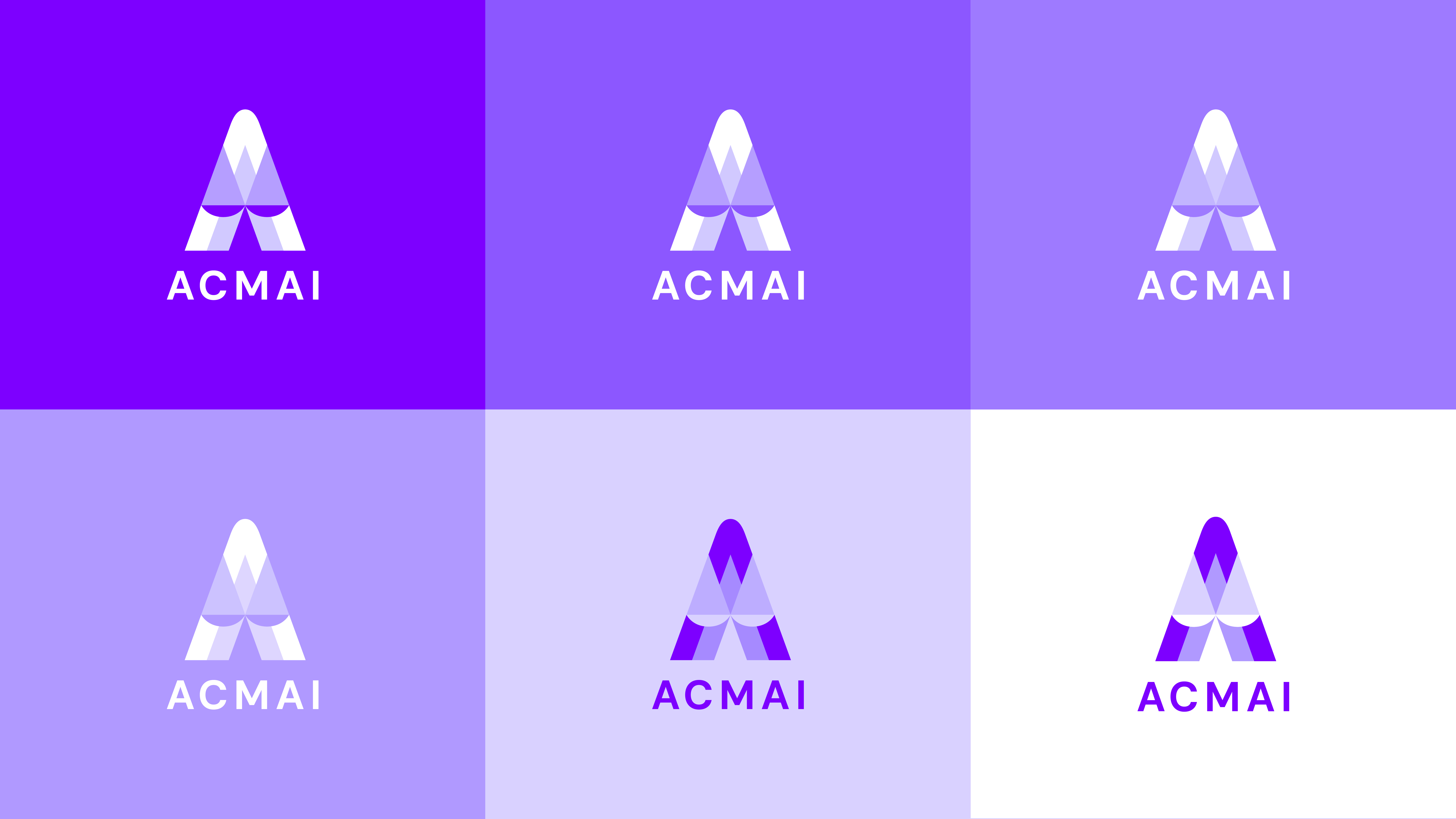
To reflect ACMAI's area of proficiency in its identity, the shapes of the logo are broken down into graphic elements that reflect the programming language used by developers.